The coffee table stands as the visual centerpiece of your living room, reflecting your personal taste while balancing functionality and aesthetics. Unfortunately, many coffee tables end up either cluttered with random items or bare and lifeless. How can you arrange decorative objects to create a coffee table that's both sophisticated and inviting? This article examines four key dimensions—proportion, layering, materials, and color—to present eight designer rules that will help you create a magazine-worthy coffee table display.
Rule 1: The 3:7 Golden Ratio—Negative Space Creates Elegance
Decor should occupy 30%, empty space 70%: Avoid overcrowding by limiting books, trays, or small plants to one-third of the surface area, keeping the remainder open and breathable.
Visual anchor principle: Select one standout piece (like a sculpture or statement vase) as your focal point, then arrange smaller items around it to prevent visual chaos.
Rule 2: The Layering Method—Create Interest Through Varied Heights
Three-tier approach:
Bottom layer: Trays, books (5-8cm tall)
Middle layer: Short vases, diffusers (15-20cm tall)
Top layer: Tall candlesticks, slender vases (30-40cm tall)
Diagonal arrangement: Position items of varying heights diagonally across the table to enhance dimensional interest (e.g., short books in the front left, tall vase in the back right).
Rule 3: Material Mixing—Creating Subtle Tension
2 hard materials + 1 soft element: For example, marble tray (hard) + brass candlestick (hard) + velvet storage box (soft).
Natural element accent: Wooden items, wicker, or clay objects can soften modern materials' coldness, perfect for Nordic or wabi-sabi aesthetics.
Rule 4: Color Harmony—Drawing From Your Living Room's Palette
60% primary color + 30% secondary color + 10% accent color:
Primary: Match your sofa or rug's color family (e.g., beige trays, gray-toned books).
Accent: Use small pops of bright color (like cobalt blue ceramic dishes or burgundy hardcover books).
Color contrast techniques: Add amber glass vessels to cool-toned spaces; balance warm environments with deep green or navy blue elements.
Rule 5: Functional Decor—Merging Beauty With Practicality
Concealed storage: Choose enamel boxes with lids to hide remote controls, or use openwork trays to organize snacks.
Dynamic elements: Small rotating objects (like globes) or adjustable-height candleholders add interactive appeal.
Rule 6: Seasonal Rotation—Making Your Coffee Table "Come Alive"
Spring/Summer: Clear glass vases + fresh cuttings (snowbell, fuchsia), paired with shells or coral decorative pieces.
Fall/Winter: Earthenware containers + dried flowers (pampas grass, eucalyptus), complemented by copper candlesticks and small wool throws.
Holiday themes: Use pinecones + red ribbon for Christmas, or switch to Chinese lacquerware boxes and potted kumquats for Lunar New Year.
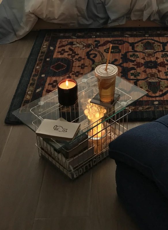
Rule 7: Light Play—Enhancing Details Through Illumination
Accent lighting: Place small LED lights (like paper sculpture lamps or crystal salt lamps) behind objects to highlight texture.
Reflection techniques: Position metallic or mirrored pieces near windows to capture natural light and brighten the space.
Conclusion: Your Coffee Table Is a Miniature Art Gallery in the Life
The essence of coffee table styling lies in expressing your aesthetic sensibility and lifestyle through carefully selected details. Expensive items aren't necessary—following principles of proportion and layering can create elegance even with simple cups and saucers. Start by adjusting just one piece, and transform your coffee table into the "soul corner" of your living room.