The living room is the heart of the home, where aesthetics meet functionality. The combination of decorative paintings and lighting not only showcases the homeowner’s taste but also creates a refined ambiance through thoughtful design. However, many people fall into common pitfalls, such as randomly hanging paintings or using harsh lighting. This article breaks down three essential principles—the golden ratio, layered lighting, and material coordination—to help you harmonize artwork and illumination, crafting a visually stunning living space.
I. The Golden Ratio: Creating a Balanced Composition
1. Ideal Size Proportions for Artwork and Walls
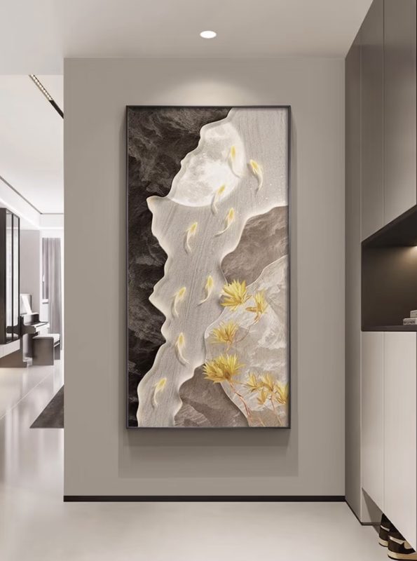
Applying the Golden Section Rule: The width of a single artwork should be approximately 0.618 times the width of the wall. The height should be centered around eye level, avoiding placements that are too high or too low.
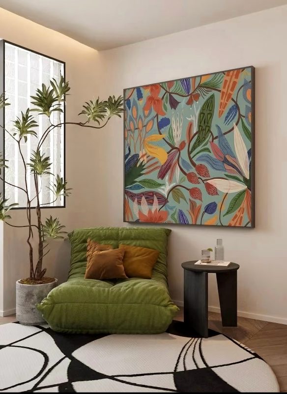
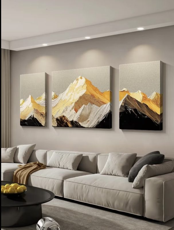
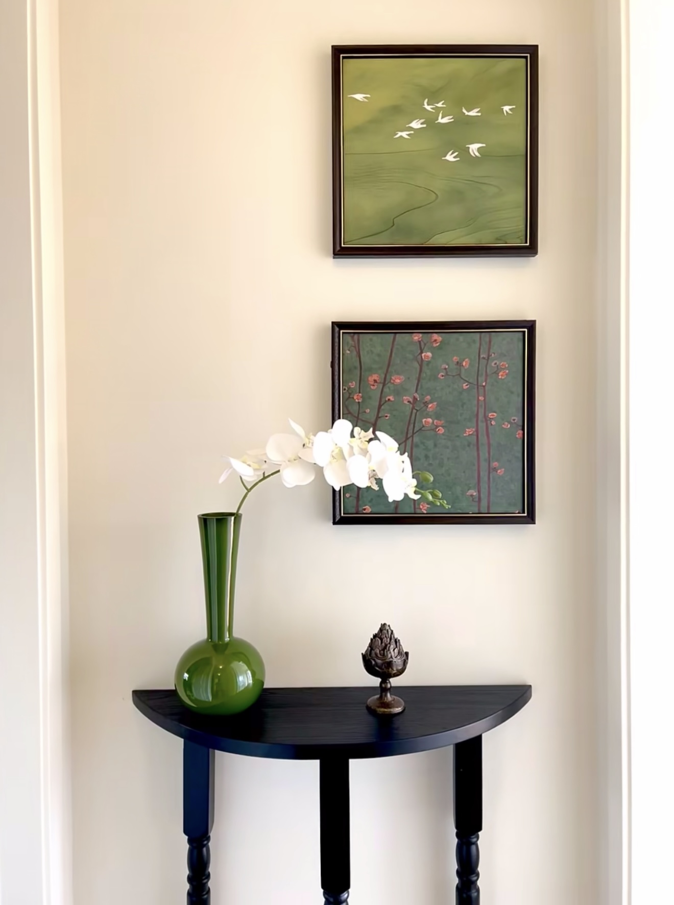
Multi-Piece Arrangements: When using multiple paintings, ensure the total width does not exceed 80% of the sofa’s length. Follow the rule of centering the main piece with symmetrical supporting pieces to prevent visual clutter.
2. Optimal Distance Between Lighting and Artwork
Spotlight Positioning Formula: The vertical distance between the spotlight and the top of the artwork should be one-third of the painting’s height. For example, if the artwork is 60 cm tall, the spotlight should be 20 cm away to ensure even illumination without glare.
Best Lighting Angle: A 30°-45° projection angle is ideal for highlighting details while minimizing reflections.
II. Layered Lighting: Using Light as a “Filter” for Artwork
1. Balancing Primary and Accent Lighting
Main Lighting Choice: Ceiling or pendant lights provide general illumination, with a recommended color temperature of 3000K-3500K (warm white light) to create a cozy ambiance.
Strategic Accent Lights: Install wall sconces or track lights on both sides of the artwork to form a triangular light zone, enhancing depth and texture.
2. The Secret Weapons of Ambient Lighting
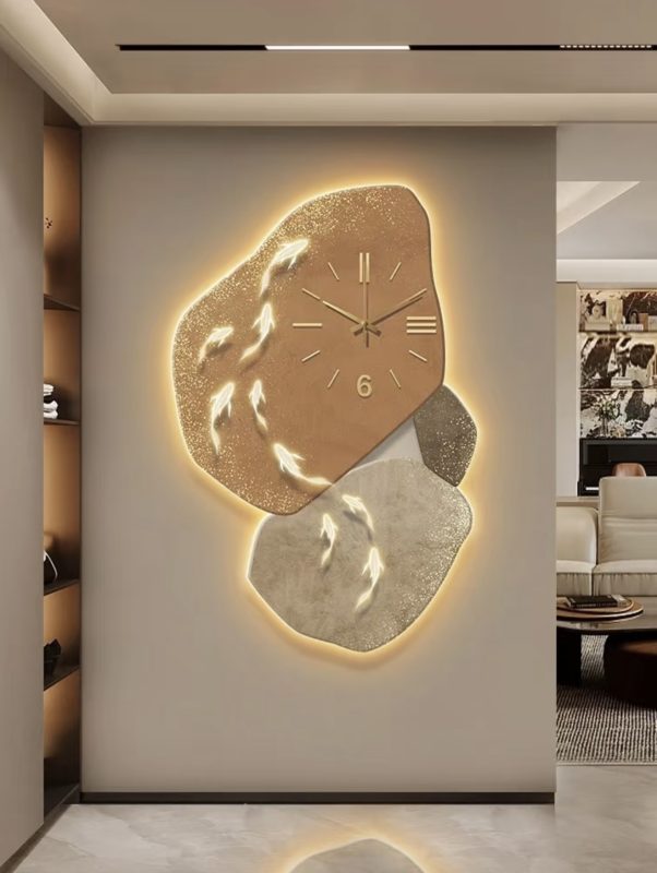
Backlit Frames: Adding LED light strips behind the artwork creates a soft glow, enhancing the texture of paintings, especially for abstract pieces or metallic frames.
Floor Lighting: A floor lamp or table lamp casting light upward can reflect off the walls, subtly illuminating the artwork. This technique works well in minimalist interiors.
III. Coordinating Materials and Colors for a Cohesive Look
1. Matching Artwork Style with Light Temperature
Oil Paintings / Vintage Themes: Use 2700K warm yellow light to enhance the nostalgic atmosphere.
Modern Photography / Abstract Art: Opt for 4000K neutral white light to maintain crispness and prevent color distortion.
2. Pairing Frame Materials with Lighting Fixtures
Metal Frames + Industrial Lighting: Black track lights or brass pendant lamps emphasize modern aesthetics.
Wood Frames + Natural Light Sources: Rattan or linen lampshades create a relaxed, organic vibe.
IV. Common Mistakes to Avoid
🚫 “One-Light-Fits-All” Approach: Relying solely on a central ceiling light results in flat and uninspiring artwork. 🚫 Ignoring Glare and Reflections: Glass-framed paintings placed opposite windows or mirrors may suffer from distracting reflections. 🚫 Clashing Color Temperatures: Using warm lighting on cool-toned paintings can make them appear dull and muddy.
V.Conclusion: Defining the Soul of Your Space with Light and Art
Pairing decorative paintings with lighting is not a matter of randomness but a blend of science and aesthetics. By mastering the golden ratio and layered lighting, even a modest budget can instantly elevate the sophistication of your living room. Start small—adjust a painting, reposition a light—and transform your space into a personal art gallery.